Provide OmniVis with a redesigned website that clearly and accurately conveys company values, and their mission and vision, while focusing on the main users, including non-government organizations and potential partners. The website will achieve these goals through a user-centered framework that portrays strong visual structure, aesthetic, and content that supports these values.
Users
Overview
By targeting these audiences, it will help us stay on track, while recognizing the goals and needs of that user set. We determined these users by asking our sponsors who they try to target with the website, and why they would end up on the website in the first place. After determining the base user groups, we were able to see why they visit the OmniVis website, and determine their needs that way.
Primary Users
Non-Government Organizations (NGOs)
Need to know how OmniVis is able to help them reach their goals, and what they need to do to connect with OmniVis.
Funders / Grant Donors
Need to be able to see why they should contribute to the cause that OmniVis is fighting, and how OmniVis does so.

Research Partners
Need to be able to see how and why they should partner with OmniVis.

Public Relations Personnel
Need to be able to clearly recognize OmniVis’ mission and vision, and how they’re saving the world.
Site Map
Overview
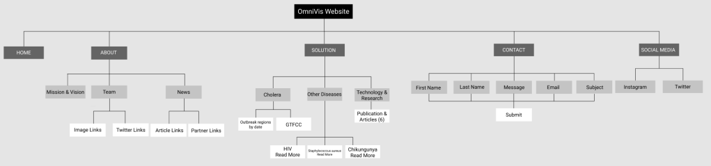
We created a site map of the OmniVis website by examining the site’s information architecture. We had several goals that we created based on the principle that we wanted to better understand the overall structure of the existing website. The creation of the site map would help us take the necessary steps to successfully redesign the website. These goals are as follows:
1. Find hierarchies and connections that allow the users to locate relevant content
2. Identify gaps and problem areas that we can fix
Takeaways
By creating the site map, the team was able to gather important insights to improve the process of navigating the OmniVis website. These takeaways are as follows:
- The site’s navigation spans far more horizontal than vertical
- The content is not very deep on each page
- The “Solution” and “About” pages are most dense with information – very text heavy
- None of the pages connect in any way (through links, etc.)
- Can only get from one page to another through the top navigation bar
- It is confusing to have options in the navigation bar that lead the user to the same page
- Consistent layouts and organization would make the structure of the overall site more intuitive
Content Audit
Overview
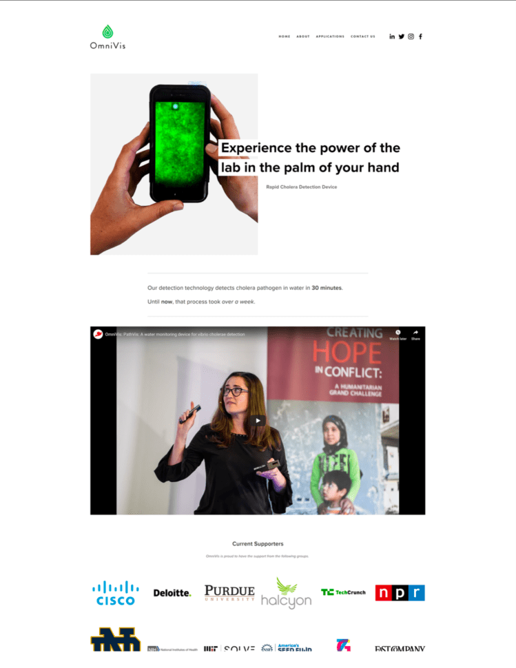
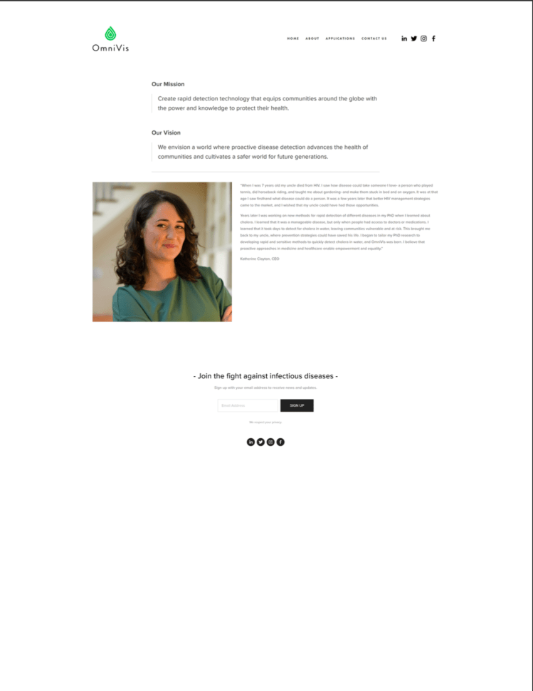
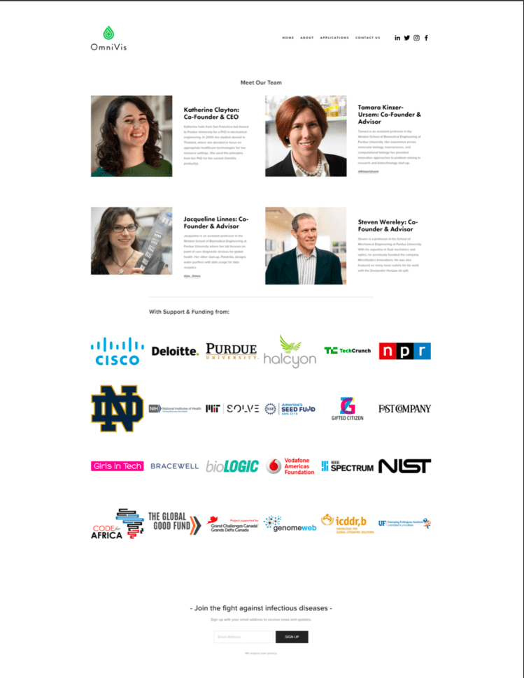
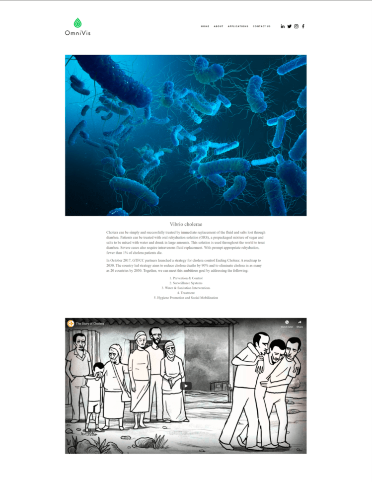
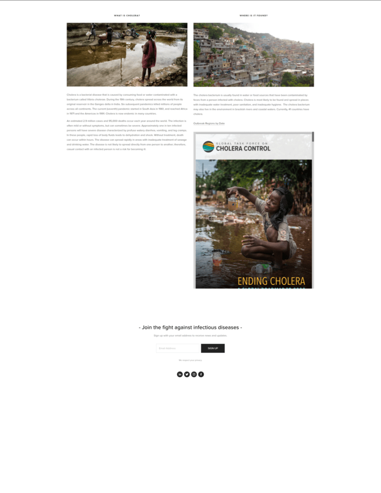
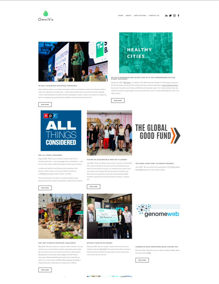
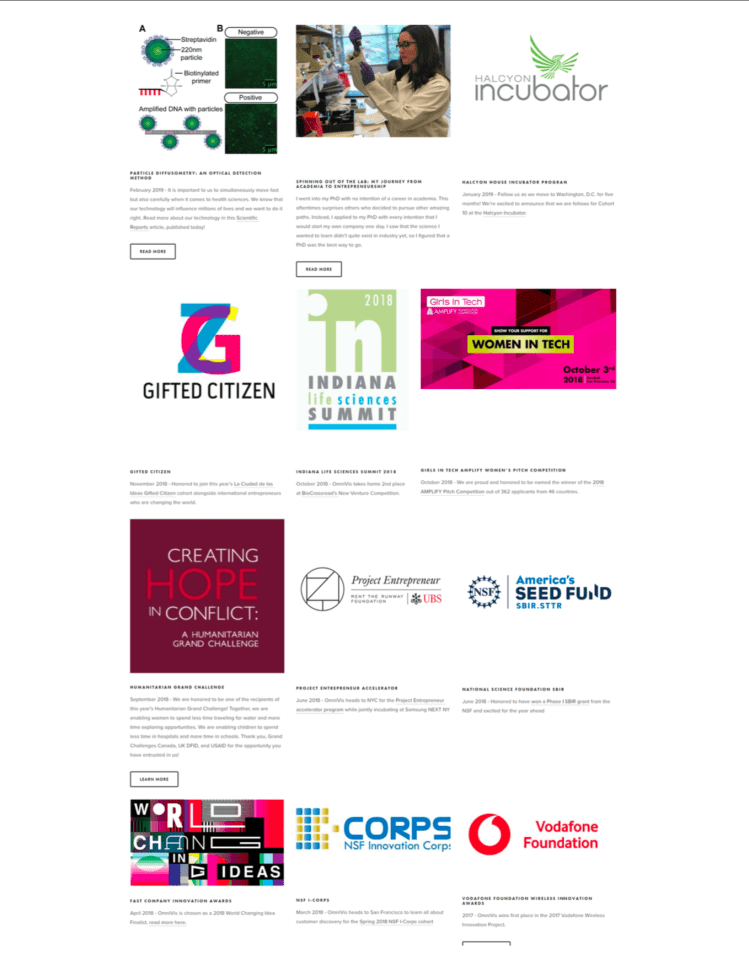
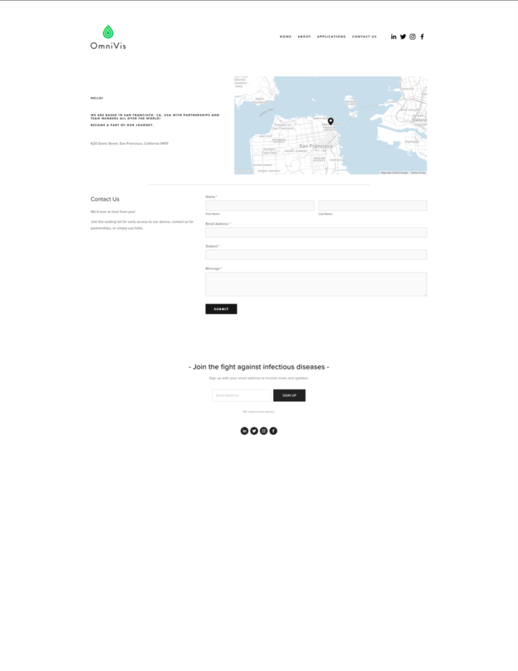
The purpose of conducting a content audit was to evaluate the content and page location within the OmniVis website. Our team sought to find strengths and weaknesses that the site currently reflected on users in order to make beneficial changes to the site. Shown on the right are the initial pages of the OmniVis website
Method
We used google sheets to organize all areas of the OmniVis website, categorizing them by page name, type of navigation, and content within each page. Our team will provide this information along with collective takeaways derived from each page.
Reflection
What we gathered from the content audit was that there is not a clear spread nor portrayal of information across the site. Our team came to the conclusion that many pages could be consolidated in a more efficient and relevant way. The amount of pages that exist with minimal information is unnecessary from a user’s point of view as they browse from page to page. Given this, our team came together and analyzed what pages could be consolidated. As mentioned previously, our sponsor requested that the “Other Diseases” page be removed entirely given that some of the diseases are irrelevant to OmniVis’ space.
Comparative Analysis
Overview
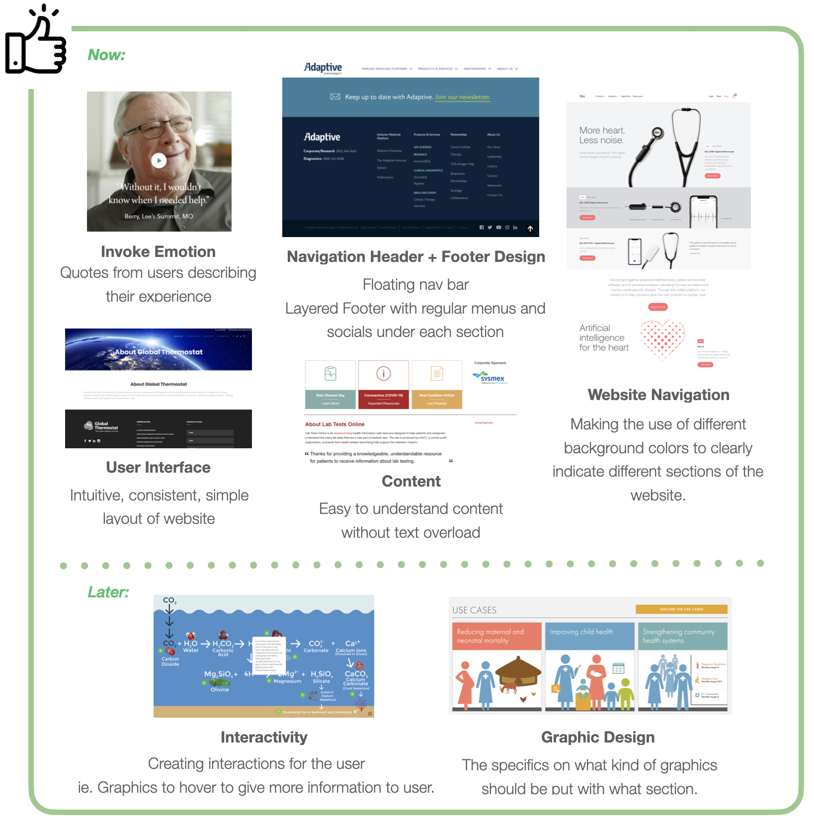
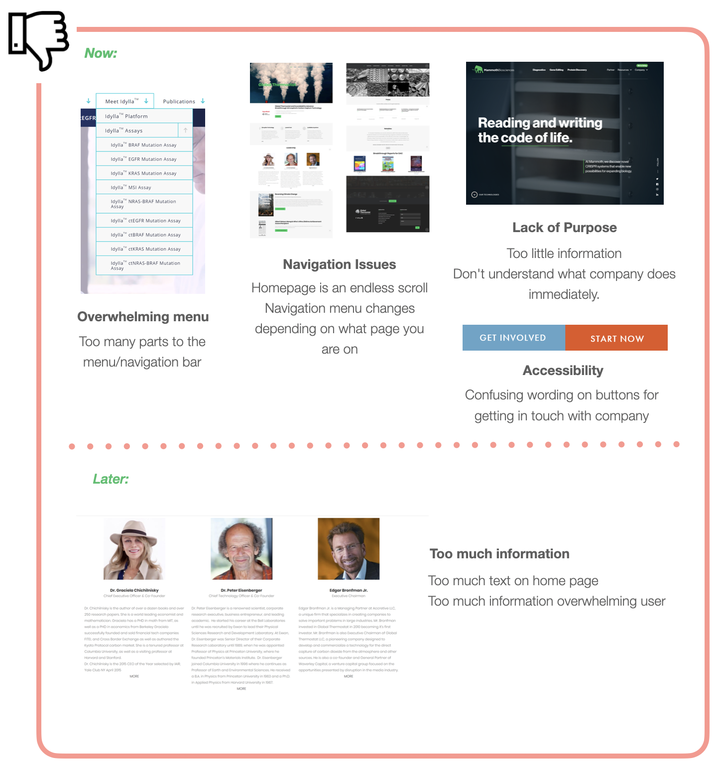
In order to gain inspiration for the Omnivis Website redesign, we decided to do a comparative analysis between 15 websites and companies within the same space as Omnivis. During our comparative analysis, we took note on what we liked and disliked for each website. We also split each list of likes and dislikes into sections of what we will can focus on now and what will be focused later in the web design process. We chose companies that have a similar problem space as OmniVis, mainly focusing on medical related technologies because OmniVis is a cholera detection platform.
Takeaways
From our comparative analysis, we were able to have a clear understanding of what we would want our website to be in the viewpoint of the user and what we would want to avoid when creating the website. We were able to understand the importance of website navigation, how much information is displayed in one page, accessibility, emotions, and UI is for an ideal website.
Card Sorting
Overview
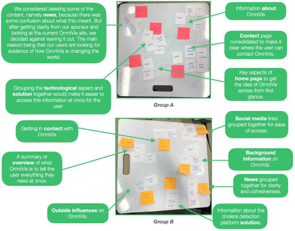
Our goal in doing this was to brainstorm how content within the website is organized categorically. This is meant to help the team with our ideation process, and aid us in rethinking how to increase the ease of navigation of content for the user.
Page Consolidation
Overview
Our team had the inclination from the beginning of this project that certain pages were simply redundant and unnecessary. Given this, before proceeding with our design work, we looked through our content audit and site map to assess what pages could be removed and where the content within those pages could be relocated in a meaningful way.
Changes made
Page Removal
Other Diseases- Our sponsor requested that we remove this page completely from the website because the page was unnecessary and didn’t aid OmniVis in any way.
Mission and Vision- Our team removed the “Mission and Vision” page from the site and relocated the content to the homepage
Complete Page/Content Relocation
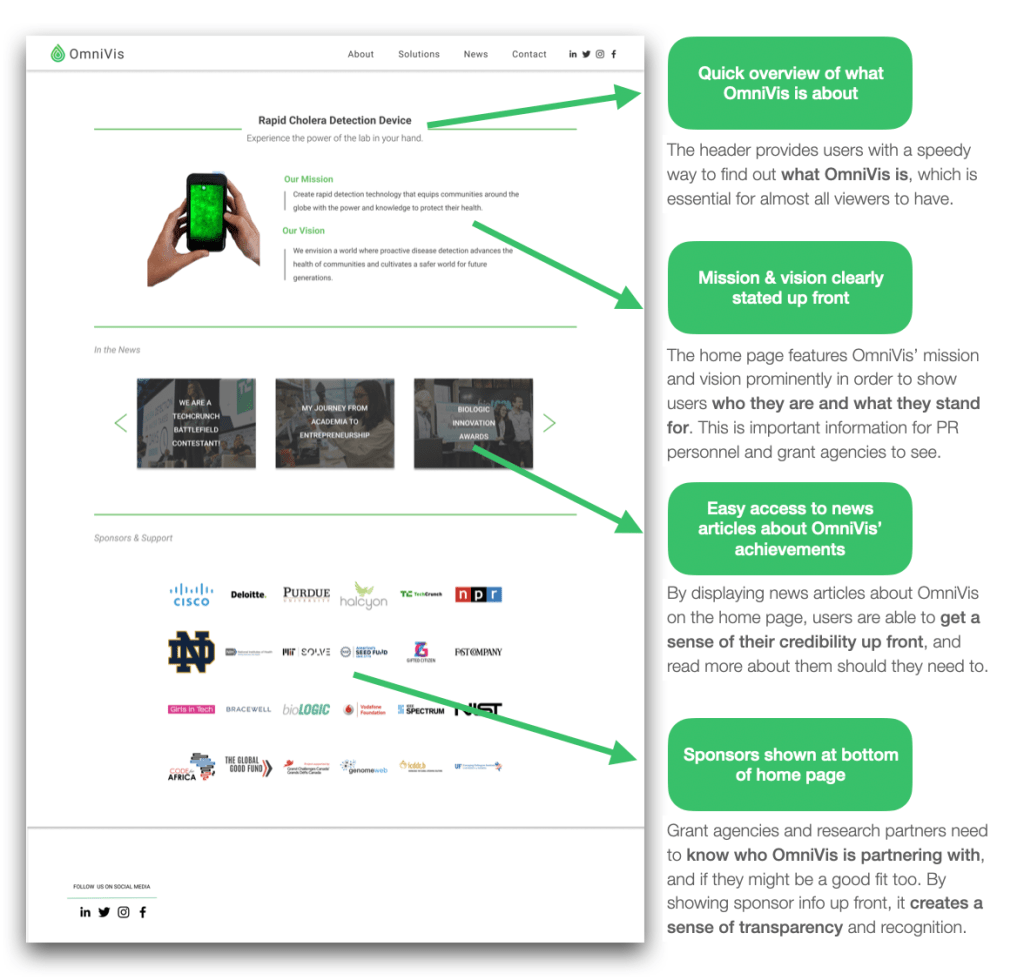
Mission and Vision- Our team relocated the “Mission and Vision” content to the homepage to provide a more robust initial impression of who OmniVis is and what it is that they do.
Partial Page/Content Relocation
News Articles- Our team moved a select amount of news articles to the homepage to provide users with an indication of company credibility and not isolate them solely within the “News” page.
Sponsors- Similar to the ideology behind the news articles above, our team relocated sponsors to the bottom of the homepage to spark a desire in our different user groups to be a part of the assistance for OmniVis’ mission within the Cholera space.
Home Page
Overview
The home page of any website should act as an introduction to what users are going to see as they navigate the website. The initial OmniVis website had room for improvement because of its broad overview and awkward formatting. The team identified the needs of OmniVis’ website viewers and determined that there was some room for improvements.
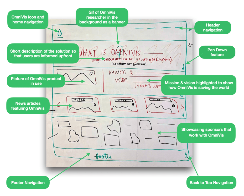
Based on research processes including the site map, content audit, comparative analysis, and card sorting each teammate was able to create influenced sketches of how they envisioned the redesigned OmniVis homepage. Below are some of the results from the individual sketching.
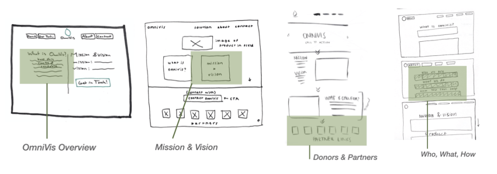
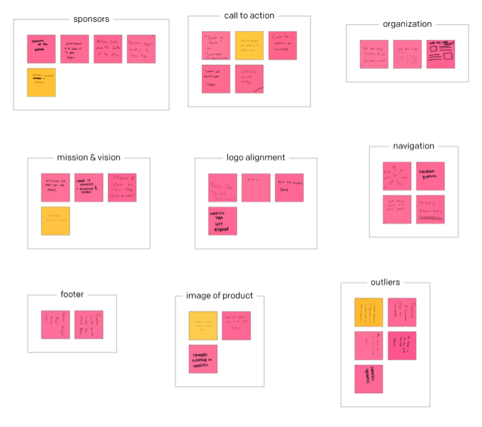
Based on our affinity diagram takeaways from our individual sketching, the team came together to create a Frankensketch. This consisted of the team singling out ideas from the affinity diagram, and evaluating how this would fit together to form on cohesive design of the homepage for our users.
After the individual sketching, frankensketching, and multiple rounds of testing, the team came to a finalized version of the home page.
Solution Page
Overview
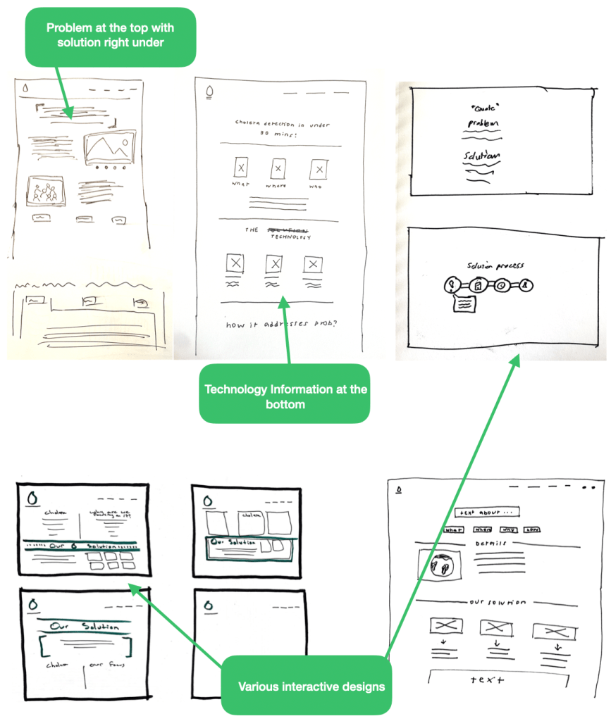
As a team, we each individually sketched our solution page ideas. We focused on organization and the order of the information within the page. The current “solutions” page on the OmniVis website lists what cholera is, where it is found, and has pictures and a video describing the story of cholera. It then has a scrollable article on the bottom of the page measuring 31 pages long.
After doing individual sketching, we wanted to focus on page structure and what users liked and disliked. We took our individual sketching insights and did a round of frankensketching within the solution page group. We came up with a number of designs that were based off of the previous design, but incorporated the takeaways from our testing.
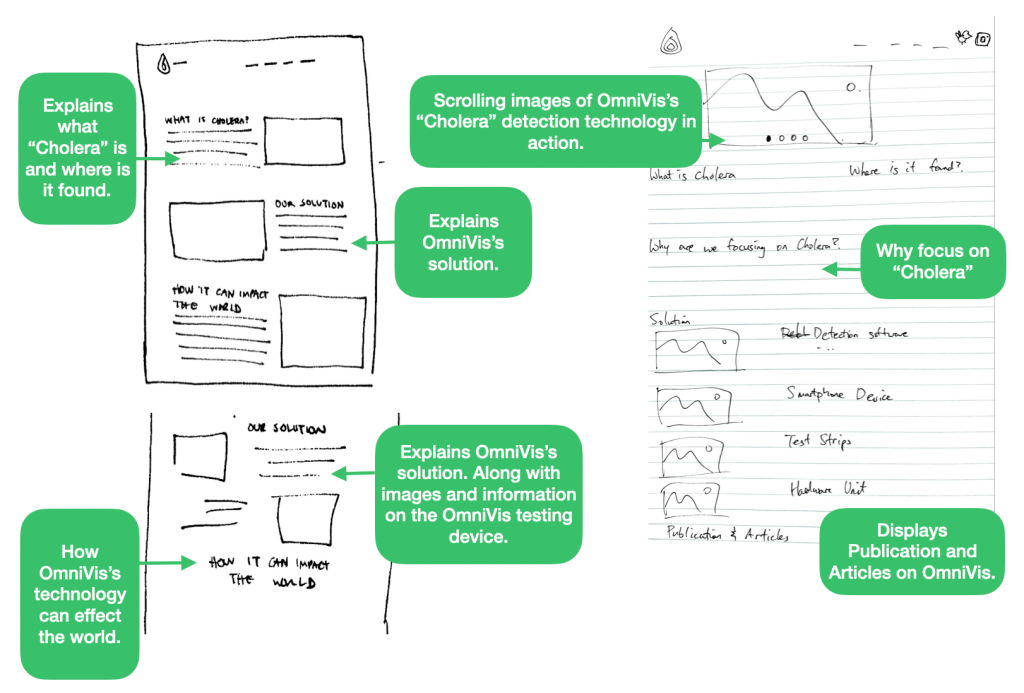
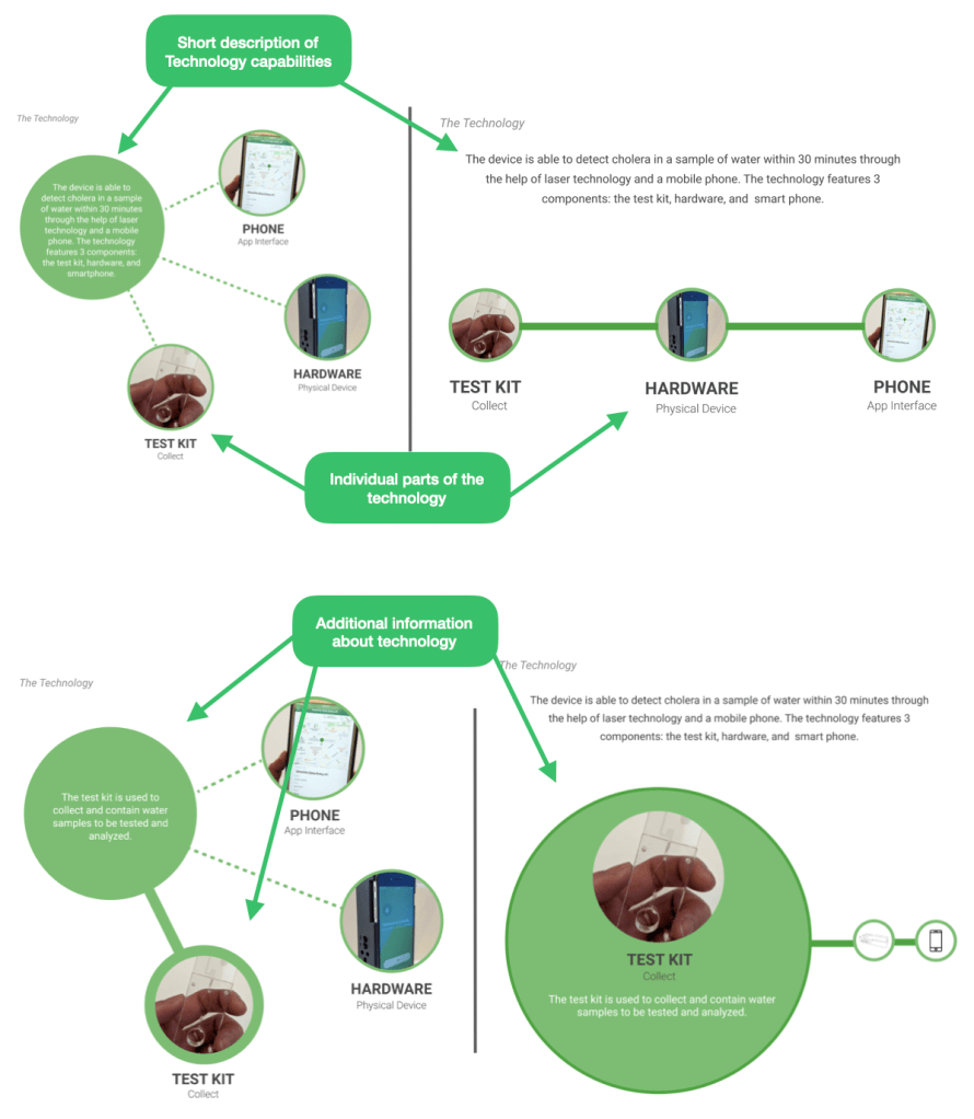
After our testing and evaluation, we created two slightly different versions of the solutions page. each one with differing designs regarding the technology section of the page. Each version has the same content, the main differences are the design and intractability.
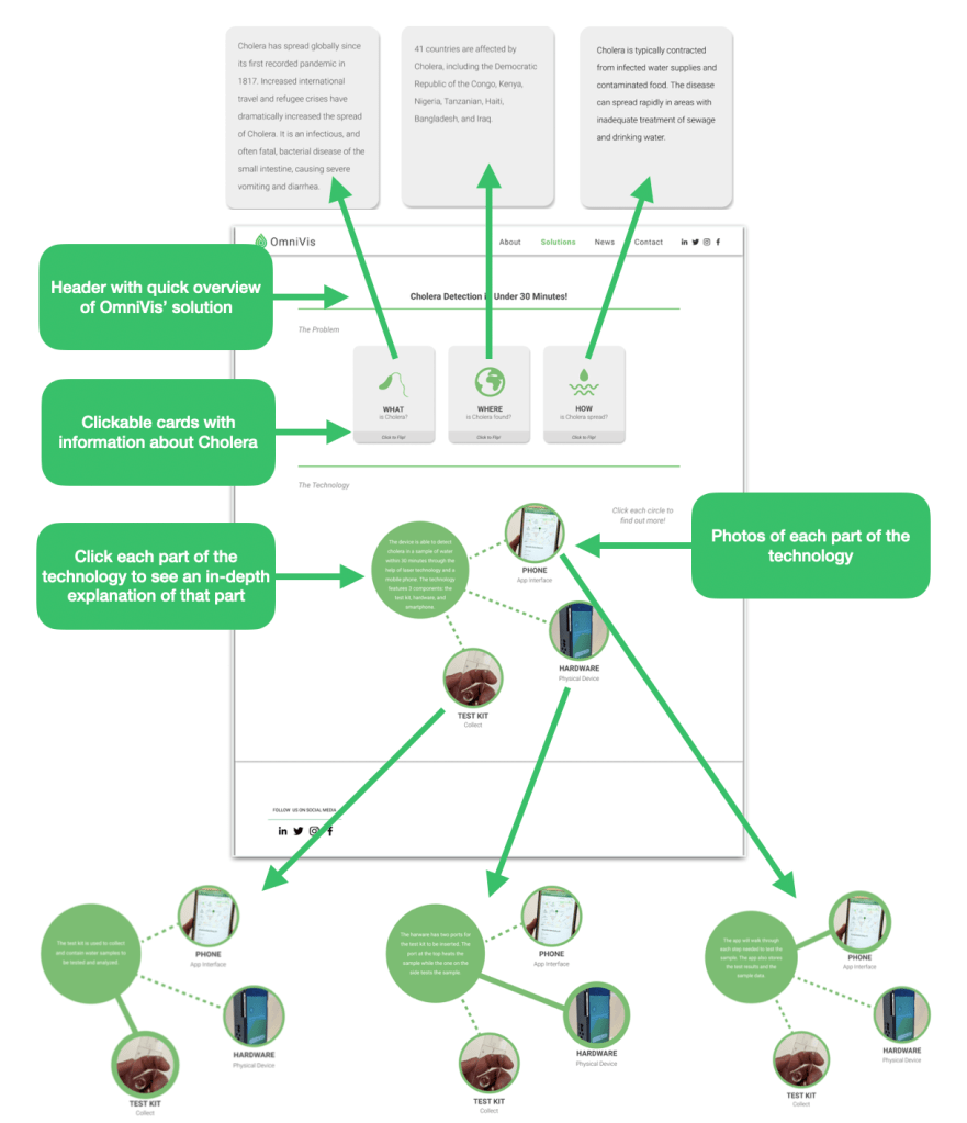
After the individual sketching, frankensketching, and multiple rounds of testing, the team came to a finalized version of the solution page.
About Page
Overview
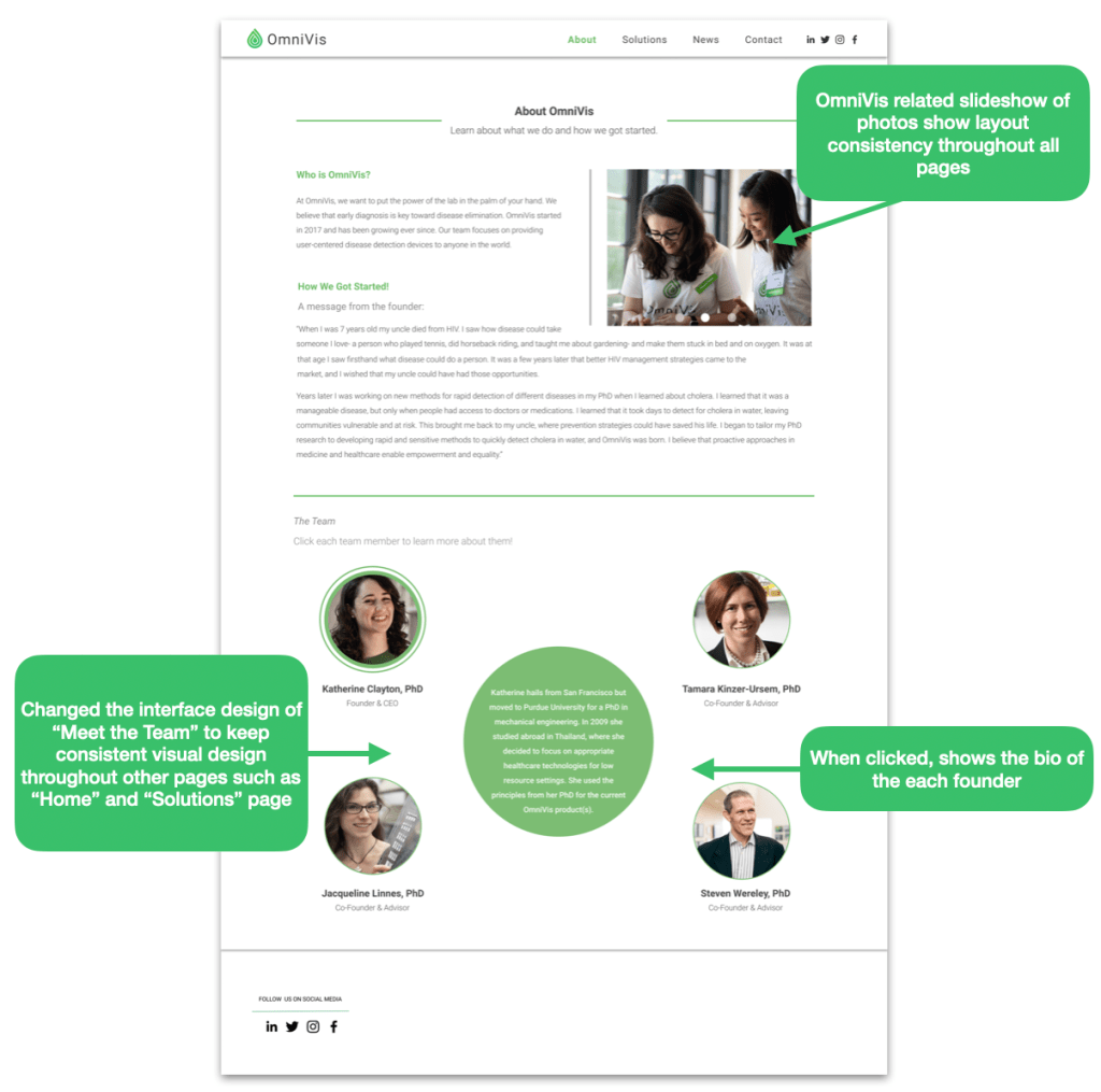
From our research and testing, we have made changes to the original About page to have the contents in right places the users expect them to be.
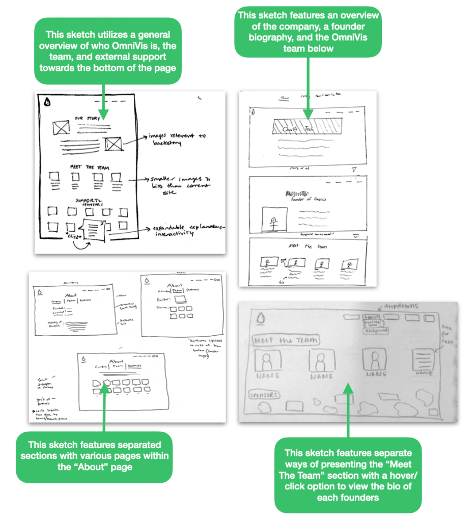
As a group, our team created a digital compilation of all our team’s sketches. Since we relocated the OmniVis mission and vision to the homepage based on our site map and content audit, our team referred back to the page consolidation and relocation information in order to assess what content should be placed on the “About” page. Since the dropdown menus for the “About” section on the current site are unnecessary and unusually spread out, our team made the decision to include three pages separated by “Company”, “Team”, and “Partners.” We housed this information in one collective “About” page, with the goal of making the navigation of the site more efficient and less spread out from an information architecture standpoint.
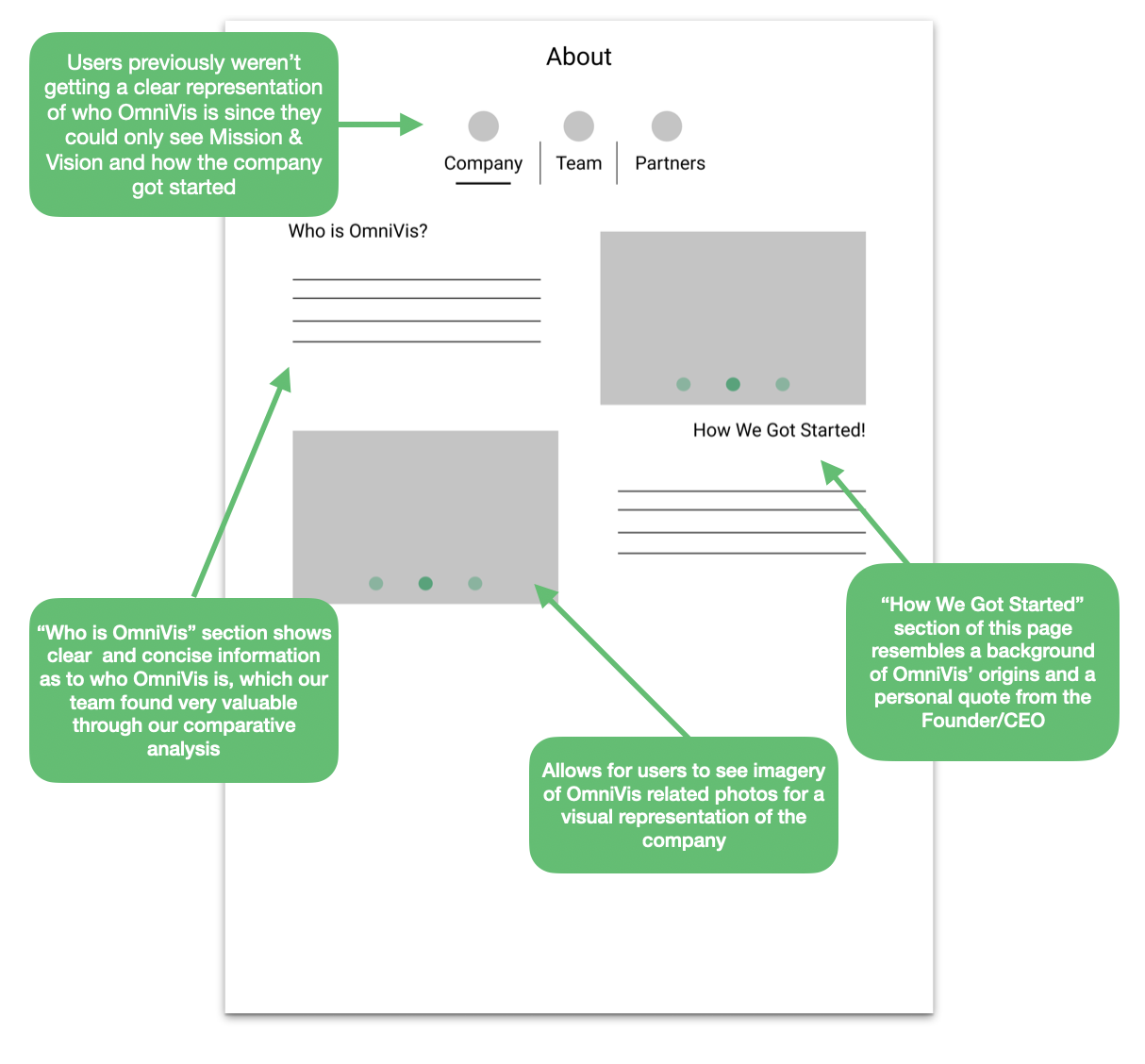
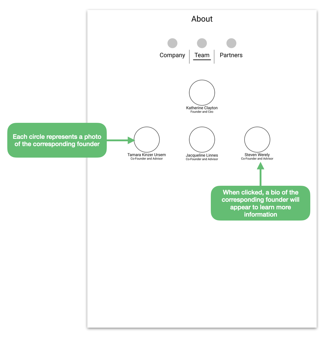
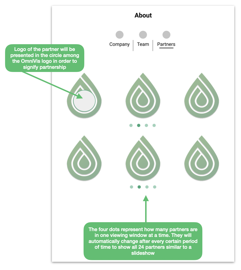
We eliminated thesectioned navigation shown on the previous versions of the “About” page as no other pages had that feature, and our goal was to keep consistency throughout all pages. This benefits the user because when the user enters the “About” page, they will be able to locate what they expected to find in “ Who is OmniVis” and “How We Got Started”. We gathered from testing that users immediately expect to find a short description of what the company does upon arrival to the page. This is an improvement from the original site as the “About” page now contains fitting and helpful information used to learn more about the company. The “Mission & Vision” element of the previous site was moved to the Home Page in order to greet users with the company’s purpose as soon as they enter the website. The list of OmniVis sponsors was also moved to the home page so that the users can gather a sense of OmniVis’ level of outreach and credibility when entering the website.
Contact Page
Overview
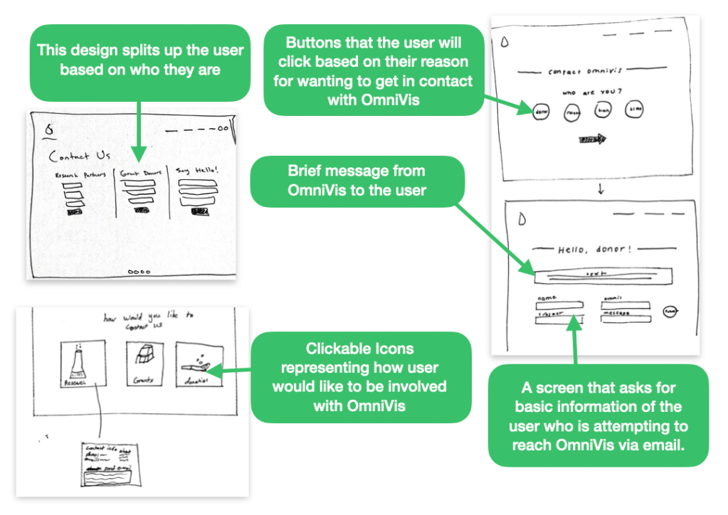
These individual sketches helped us realize what the redesigned “Contact” page could look like and how the changes we incorporated into these sketches would benefit each of our user groups. Our team collaborated on each of these sketches and moved forward with a goal of creating one unified version of these sketches which would take the beneficial changes from each sketch and incorporate them into one contact page experience.
In this frankensketch we decided to make sure the web pages were easily navigated with the use of icons and a simplistic interface that reduces confusion and gives the user a special feeling when users try to get in contact with OmniVis through apparent of a specific person is answering all quest and concerns you may have.
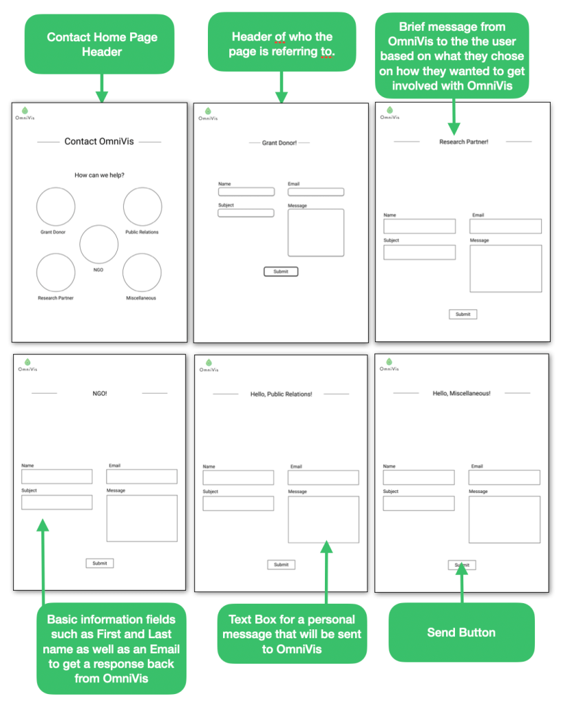
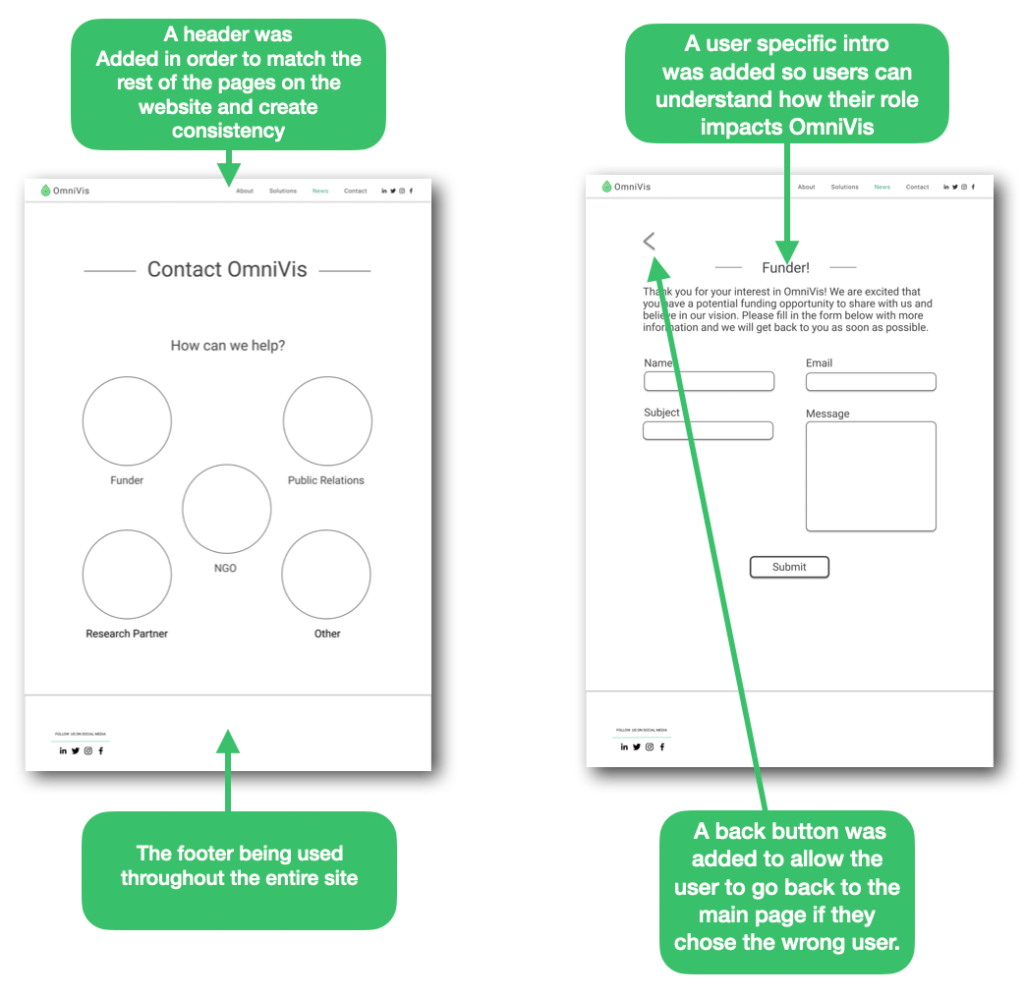
Our goal with the next iteration of the contact page was to add a user-specific phrase that would greet each type of user as they entered their designated page. Our team also added the header and footer that was being used across all of the other pages our team was designing to begin to get a sense of what the final “Contact” pages would look like and to create visual consistency across all designed pages.
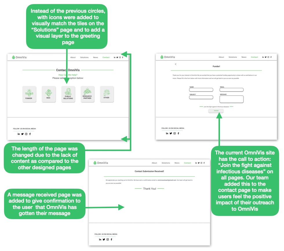
For the final iteration of the contact page, our team altered the visual design of the pages to achieve consistency throughout the site. The changes we made include: changed the sizing of the pages to match the rest of the site, user specific tiles with icons to match the “Solutions” page layout, page-wide coloration of the same green used across the site, and a “Contact Submission Received” page for confirmation.
News Page
Overview
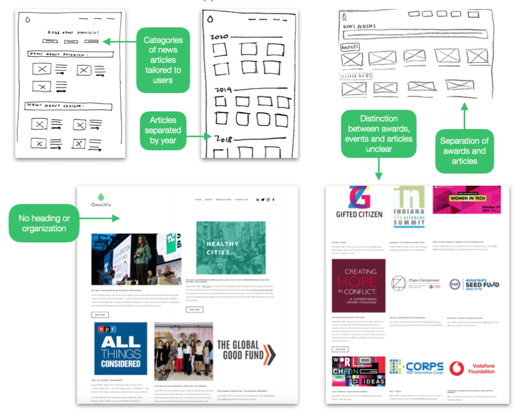
Our team did a round of individual sketching to draw out our ideas and to think of ways to better organize the “News” page. The existing News page highlights different articles that OmniVis has written or been mentioned in as well as different awards they have received and events that they have participated in.
After organizing the individual sketches and using the information we gathered from our research (comparative analysis, card sorting, and content audit) to gather the main elements of the redesigned news page that we wanted to include, our group continued to ideate with those elements in mind, resulting in the sketches below. We then took these sketches and translated them into Figma in order to move forward with testing. Under normal circumstances, we would with our test paper prototypes first (like we did for the home page), however due to the restrictions of remote testing we decided to translate our sketches into low-fidelity digital mockups to serve a similar purpose as paper sketches would in a face-to-face testing scenario.
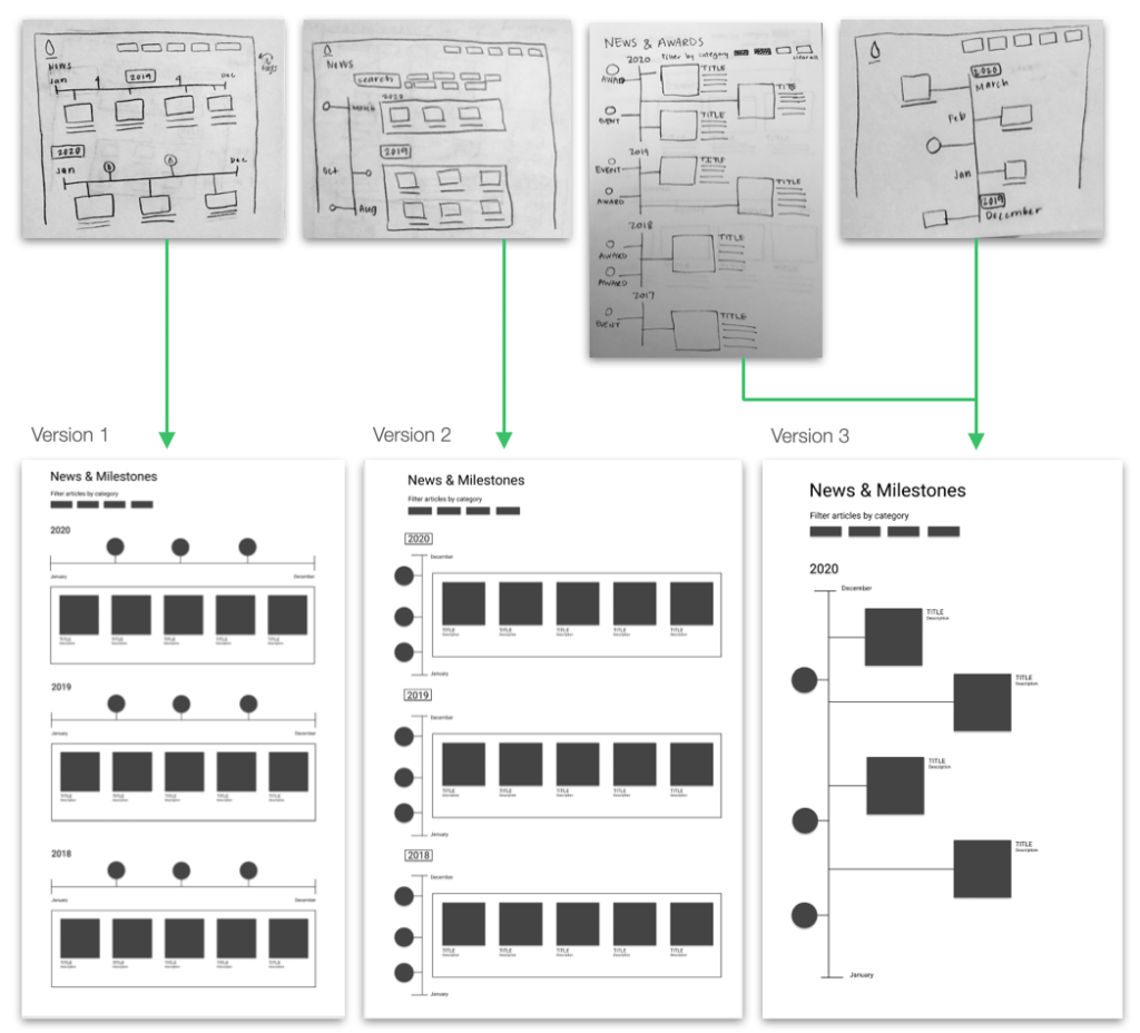
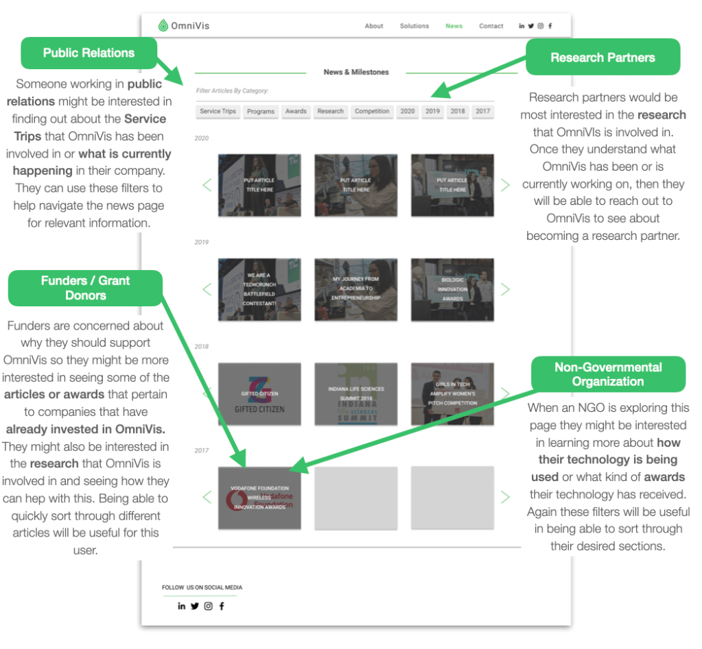
In the News page the most important aspect of using this page is for users to be able to navigate through the different news articles, programs, and awards. Using filters to quickly find these categories is important for each user. Outlined below is how each of our four users (Public Relations, Funders / Grant Donors, Research Partners, and Non-Governmental Organizations) might interact with the page.
My participation
- I actively participated and engaged in the discussions to portray my thoughts and views to contribute to the team.
- Along with Jack Bannon and Skyler Beld, I worked on the “Contact” page and the “About” page for our presentation and documentation.
- I provided my part of the comparative analysis and doing the sketches for the necessary pages.
- I championed class-time record keeping duties during the semester so the team could go back and find out what was done in each day, if necessary. I also alerted the team leaders on upcoming events and submissions.
- When working on documentation, I championed the “About” page and the “Table of Contents” and “Appendix” section.
- During sponsor meetings, I actively participated and spoke to our sponsor on one part of the agenda every meeting.
 James Chang's Portfolio